User Pain Points
- Inconsistent iconography treatment in System Feedback & Alerts
- Inconsistent color application across Button and Input components
- The small and restrictive color palette
- Lack of accessibility guidance in the color approach
- One-note color palette
- Doesn’t support new company brand
Defining the Scope
After completing the System Feedback and Alerts project in late 2021, designers raised concerns about an inconsistency in those visual designs (fill color of the iconography) and the broader use of yellow/orange in the Horizon Design System (HDS). We also received feedback notes from designers consuming the design system concerning color. As a result, we attempted to resolve all these issues at once through a more extensive overhaul of the color approach, tackling the root issues.


Goals
- Guide consistent iconography fill-color in components like the System Feedback & Alerts that used yellow and other low-contrast colors
- Unify the color approach across Button and Input components
- Provide an expanded color palette along with comprehensive and useful color styles for cross-disciple adoption
- Provide Universal Design documentation, including accessibility guidelines in the new color system
- Develop a new color palette with more color choices to allow for the intentional use of color and variety to the UI’s appearance
- Adopt the new company brand*
*Added late in the project timeline
Approach
My colleague and I began by brainstorming palette ideas, hoping to move away from our monochromatic color scheme. Our guidance was to pay homage to the existing color usage, maintain an approach that wouldn’t stray too far from the current application of color, and finally, begin adding colors that might feel spiritually connected to the Vericast brand. Erin and I developed the first round of palette options, each with different approaches (Complementary vs. Split-Complementary, etc.). We presented the directions to the team and received a wide range of feedback. Our Product Design team was rapidly growing at the time, and we found the often contradicting feedback challenging to incorporate into the project. Eventually, we picked two approaches, one of which added orange, a key color in the Vericast brand. The other used different colors.

We also received resources from a fellow designer/dev on Universal Design, including accessible color palettes. We combined this with the HSL approach we were developing. Erin and I then worked to create a presentation of a unified approach, including Accessible color pallets and examples of possible implementation.

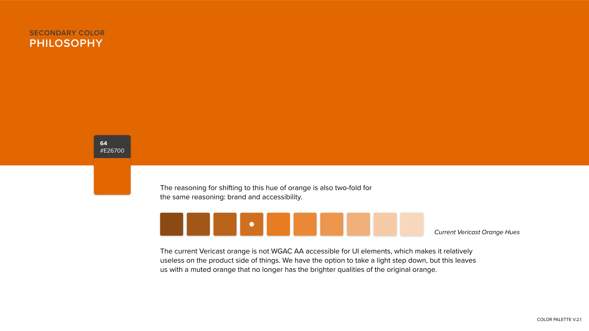


Unfortunately, at this time, we received direction from leadership that non-conformity with the Vericast brand would no longer be an option, and we had to rethink our goals. We kept some of our objectives previously defined, and others were forfeited. We were still able to include Accessible Color Palettes, one of the essential elements of our work at this point. After reworking the palettes to resemble the Vericast corporate branding closely, I (I was working on this project alone by this point in the project timeline due to the workload on the team) shifted my focus to adoption within the HDS.

Based on feedback from fellow designers, I worked in a separate Figma file to trial a new Color Styles approach I had developed based on precedent research of other industry-best design system color approaches. I incorporated several colors approaches into my process, which included hierarchy, use case, text style usage, and selected dark mode styles. I called this a “Color Implementation Model.”

Documentation
My approach to the documentation of the new Color System within the core HDS components file was to split the documentation between a sheet on a board within the document itself and the native Figma color styles controls. Figma has fields for Color Style naming and descriptions, which I took advantage of to achieve desired goals of the project. Between the two resources, I used grouping to imply the different levels of hierarchical usage within the Color System. I also returned to my precedent research to guide the sorting of the styles. Concerning the Color Styles sheet within the document, I reached out to several key stakeholders. I asked them to submit early ideas for what they’d like to see in the color documentation. I received great feedback and used that to guide what to include in the Color Styles document. One item not included in the images attached to this project is variables. We hope to develop variables with a helpful syntax in cooperation with our UX Engineer and the Front-End Dev team soon.


Outcomes
- Expanded Color Palette offered in the HDS core file, which conforms to the Vericast brand and allows for the intentional use of color variety in the UI’s appearance
- Supports new flagship products for the company, which had an urgent need for branding
- Supports developing reporting and monitoring platforms in Tableau, including Data Visualization
- Universally designed color styles, including guidance for accessible color usage according to WCAG
- New comprehensive and useful color styles were added to the HDS core file and documented
- New color styles incorporated throughout components and resulting Visual Design “bugs” resolved
- Provided guidance for consistent iconography fill color in components like the System Feedback & Alerts using yellow and other low-contrast colors
- Provided a path for unifying the color approach across Button and Input components


